
Designing Clarity: How I Improved Ela Travel’s Onboarding & Navigation
For Ela Travel's internship process, I was tasked with a 6 hour design challenge: Create a simple mockup of Ela’s new user onboarding flow. Our primary goal is to capture user interest quickly and demonstrate our value proposition. I was provided with
Timeline
6 hours (July 2023)
My Role
Sole Product Designer
Scope
UX Research
Wireframing
User Testing
Prototyping
Tools
Figma
Wireframing
Design System
UX Audit
Before proposing solutions, I evaluated the existing experience to uncover friction points and structural inconsistencies.
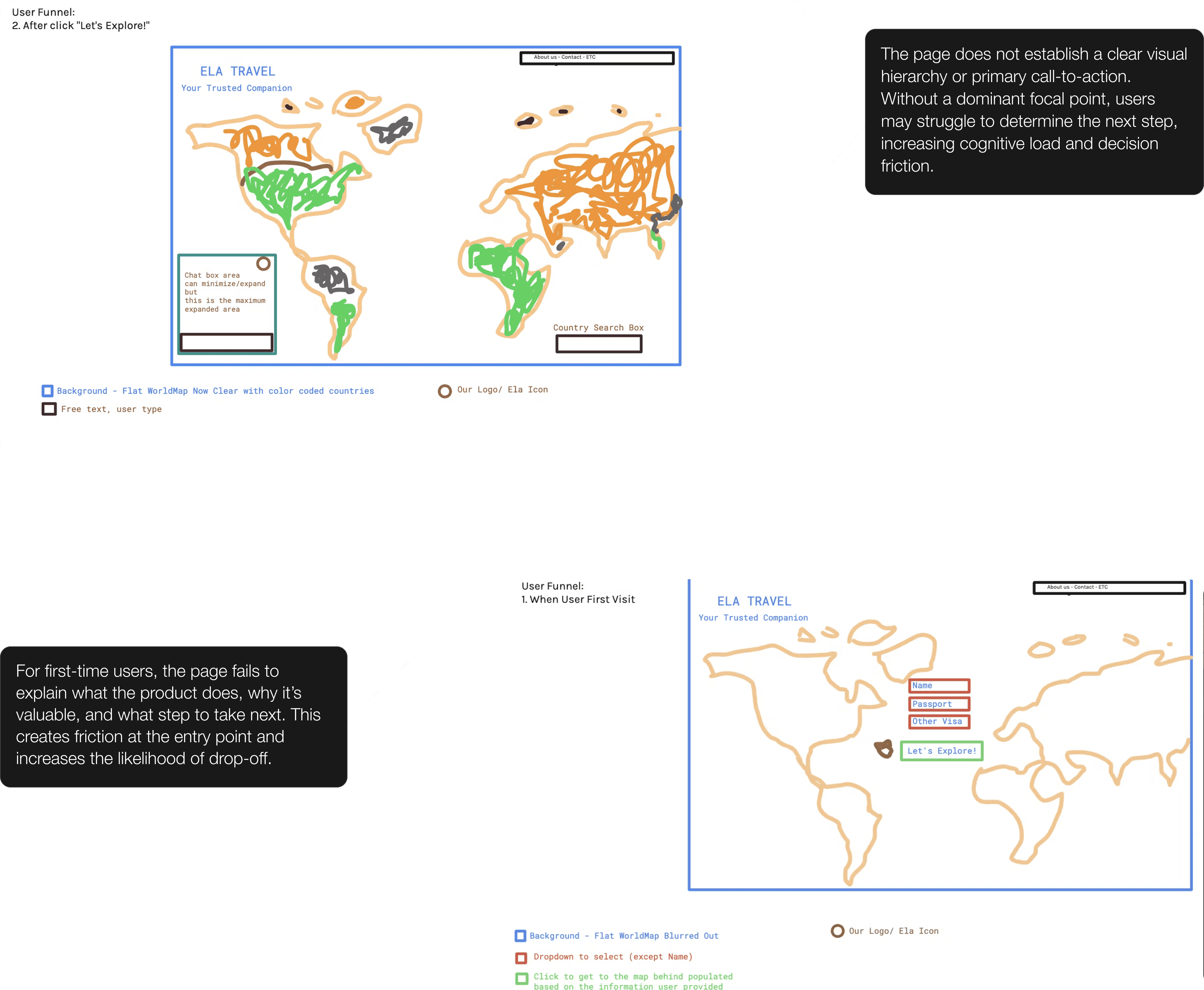
Understanding what travelers were trying to accomplish— and what was holding them back.
User Goals
Find out which countries they have access to
Apply for necessary visas
Plan their trip
User Pain Points
Applying for visas is time consuming, repetitive, and risky
Hiring a travel agent can be to expensive
Refining the user flow.
Thinking through the process of users interacting with the service.

I focused my designs on my initial design goals, focusing on creating clarity, efficiency, and fostering user engagement.

Design System
Typography
I opted for a sans-serif font for a clean and easily readable experience.
PP Mori SemiBold
ABCDEFGHIJKLMNOPQRSTUVWXYZ
abcdefghijklmnopqrstuvwxyz
0123456789
PP Mori Regular
ABCDEFGHIJKLMNOPQRSTUVWXYZ
abcdefghijklmnopqrstuvwxyz
0123456789
Colors
Colors of green, teal, and blue convey feelings of adventure, trust, loyalty, and calmness.

Final Designs

Through this product design challenge, I learned how to effectively navigate the design process under a tight deadline, prioritizing key tasks and decisions within a six-hour window.
Additional learnings:
Working efficiently to deliver meaningful results under tight deadlines.
Presenting my findings to a team, clearly communicating my design decisions and thought process.
Proving my capability to adapt and succeed, ultimately leading to me securing the internship position.
like what you see?
Feel free to check out my next case study, or send me a message on Linkedin!
2026 portfolio by anna knick
aknick90@gmail.com